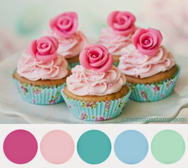
I signed up for Kelly Purkey's Sketchbook class at Studio Calico
and, this weekend, I made a layout and a card using the sketch.
I'm not allowed to post the sketch here on my blog,
but here are my projects.
Here's the layout I made for Sketch 3:
I decided to do a "currently" layout for Sage and used PTI's Slide Frame die
with six different shades of Bazzill Basics cardstock: Robin's Egg, Pale Rose,
I adhered them all to a piece of 12x12 Bazzill Basics Classic White cardstock, which I
trimmed down to 11 5/8x 11 5/8" and matted on some Robin's Egg.
I also stamped on each frame, using either my Kelly Purkey stamp set
that I got when I signed up for the class or PTI's Slide Frame stamp set.
Here are some close ups:
For my title, I stamped it using PTI's Wet Paint Alphabet stamp set.
A trio of enamel dots finishes it off.
For my card, I used the same colours of cardstock along with a Pretty Pink Posh stitched die.
I diecut the fox from PTI's Wee One Mini Kit and
stamped the sentiments from the coordinating stamp set.
I'm also linking up this layout and card to this week's
Thanks for looking!


12 comments:
Leigh, just beautiful !
Great lay-out with your daughter !
Just plain gorgeous! Love your layouts and that card is so sweet. Beautiful colours. Xx
Beautiful layout for your beautiful little girl! And I love the card, Leigh. It's so striking in those gorgeous colours.
A sweet layout of your darling young lady, and I love the card, too! Great use of our colors for this week, Leigh! Thanks again for playing along with us at the Simon Says Stamp Wednesday challenge! (I heart that PTI set!)
Your card and layout are both so sweet.
Love the bright colours and the colour block look.
Beautiful layout and CAS card. Your daughter is darling and growing up,so fast.
Leigh, I fall in love with your layout and card too! Simple and fabulous
Fabulous layout and what a great idea to document what Sage is into right at the moment. Your card is very sweet as well.
Love the layout! Great idea to journal right beside the picture. The colors are awesome in both your card and your layout.
Akkk, omgosh, these are SO fabulous, Leigh! I absolutely LOVE both your card and layout! I am SUCH a sucker for a good grid design, and these are just outstanding! Love the little frames and LOVE the colors! How clever and smart to do a layout like this! And I am dying over that sweet little baby fox! Dying!
Look at that smile... what a darling, sweet, fresh look on life Sage has, Leigh! Like Audrey? I'm also dying over that fox ...
=] Michele
How confidence boosting your Sage Lately page must be for her, Leigh! You've created a sweet 'at-the-moment' document of her accomplishments, her goals (Montreal...cool!), and her free-time activities. When she looks back on this - in a week, a month or over a span of years - she'll be so touched! You've made abundantly clear how much she - and what she does - matters! She's quite the bundle of energy and 'diversity'! Love it! Your card: a-dor-a-ble!
~c
Post a Comment